
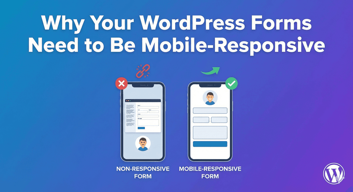
Why Your WordPress Forms Need to Be Mobile-Responsive
Here’s a number worth sitting with: for most websites, more than half of all visitors arrive on a phone. That means the majority of the people meeting your form are looking at it on a small screen — and if that experience is anything less than smooth, you’re losing submissions you’d otherwise have won. Mobile-responsiveness isn’t a nice-to-have for forms; it’s where most of your completions are decided. Here’s why it matters and how to get it right.
Most of your form traffic is mobile
Whatever your form is for — contact, signup, booking, application — a large share of the people filling it in are on a phone. They might be on the move, on the sofa, or squeezing it in between other things, but they’re on a small touchscreen either way. A form designed only for desktop treats those visitors as an afterthought, and they feel it.
What breaks on mobile
When a form isn’t built responsively, the problems are predictable and painful:
- Fields spill off the edge of the screen or become too narrow to use.
- Text is tiny, forcing people to pinch and zoom just to read labels.
- Buttons are too small to tap accurately.
- Multi-column layouts that look fine on desktop become a cramped mess.
- Long forms feel endless on a small screen, driving people to give up.
Each of these is a reason for someone to abandon the form — and on mobile, patience is short.
Responsive by default
Auto Form Builder forms are mobile-responsive out of the box. Rather than making you build separate versions, the form adapts to the screen it’s on — desktop, tablet, or phone — so fields resize, layouts stack sensibly, and everything stays tappable and readable. You get a form that works everywhere without extra effort.
Preview every device as you build
The best way to guarantee a good mobile experience is to actually look at it. As you build and style in the builder, you can preview your form on desktop, tablet, and mobile. This matters because a layout that looks perfect on a wide screen can feel cramped on a phone — a Name field side by side might be roomy on desktop but tight on mobile. Checking all three as you go means no unpleasant surprises after you publish.
Design with mobile in mind
A few habits make forms even better on phones:
- Keep forms short — long forms feel much longer on a small screen.
- Prefer single-column layouts on mobile so fields stack cleanly.
- Use clear, large labels and generous spacing.
- Make the submit button prominent and easy to tap.
- Break long forms into steps so each screen holds a manageable chunk.
Your styling options let you tune spacing, buttons, and layout to feel right on every device.
Mobile-first is submission-first
Because so many of your visitors are on phones, a mobile-friendly form isn’t just about looking good — it directly determines how many people finish. Build responsively, preview on mobile, and keep the experience simple, and you turn your largest group of visitors into completed submissions instead of lost ones. With Auto Form Builder, responsive is the default, so you’re most of the way there already.
Related reading: How to style WordPress forms to match your brand and lightweight form plugins for fast WordPress sites.
Ready to build forms that work on every screen? Install Auto Form Builder free from WordPress.org.
FAQ
Are Auto Form Builder forms mobile-responsive?
Yes. Forms are responsive by default, adapting to desktop, tablet, and mobile, and you can preview all three as you build.
Why does mobile-responsiveness matter for forms?
Most web traffic is on phones. A form that's hard to use on mobile loses submissions, so responsiveness directly affects how many people complete it.